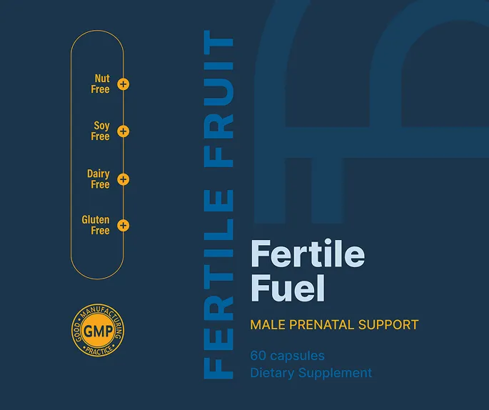
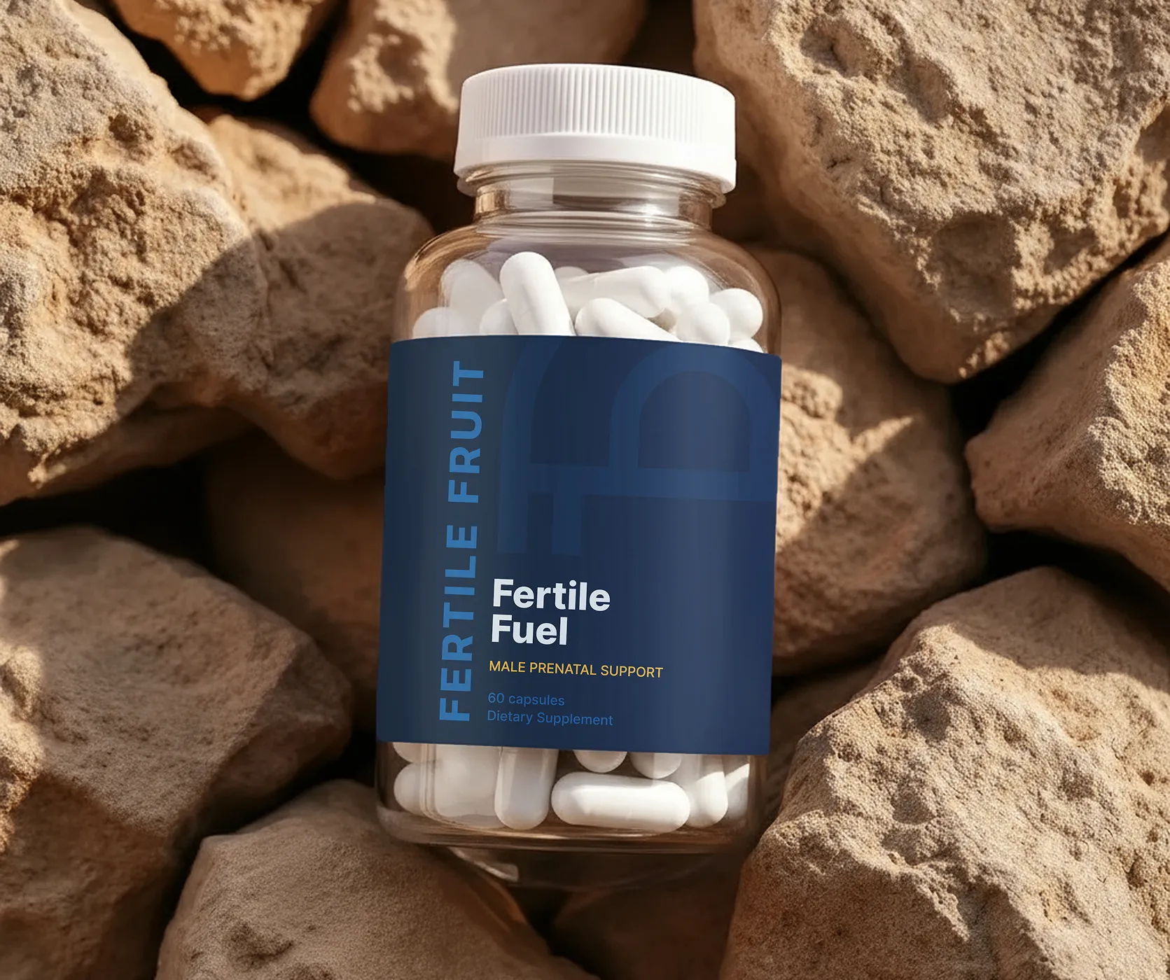
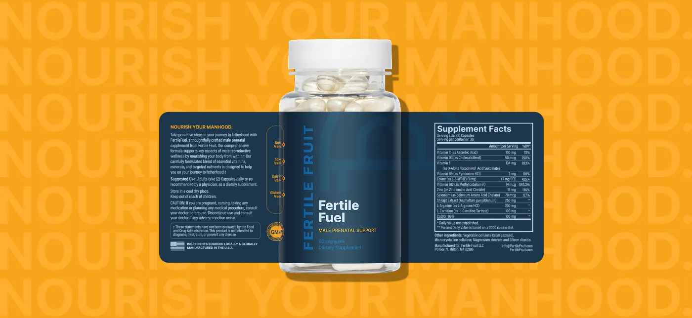
Fertile Fruit needed a label that would speak directly to men without looking like every other generic supplement on the shelf. We created a bold, modern design that feels approachable and trustworthy—clear enough to communicate the science, but distinct enough to feel like a product someone actually wants to keep on their counter. Everything from the color palette to the type hierarchy was built with clarity, credibility, and shelf appeal in mind.


"Katie was fantastic to work with! She understood immediately what I was trying to accomplish and finished the job quickly. I am extremely happy with the work product she delivers."


